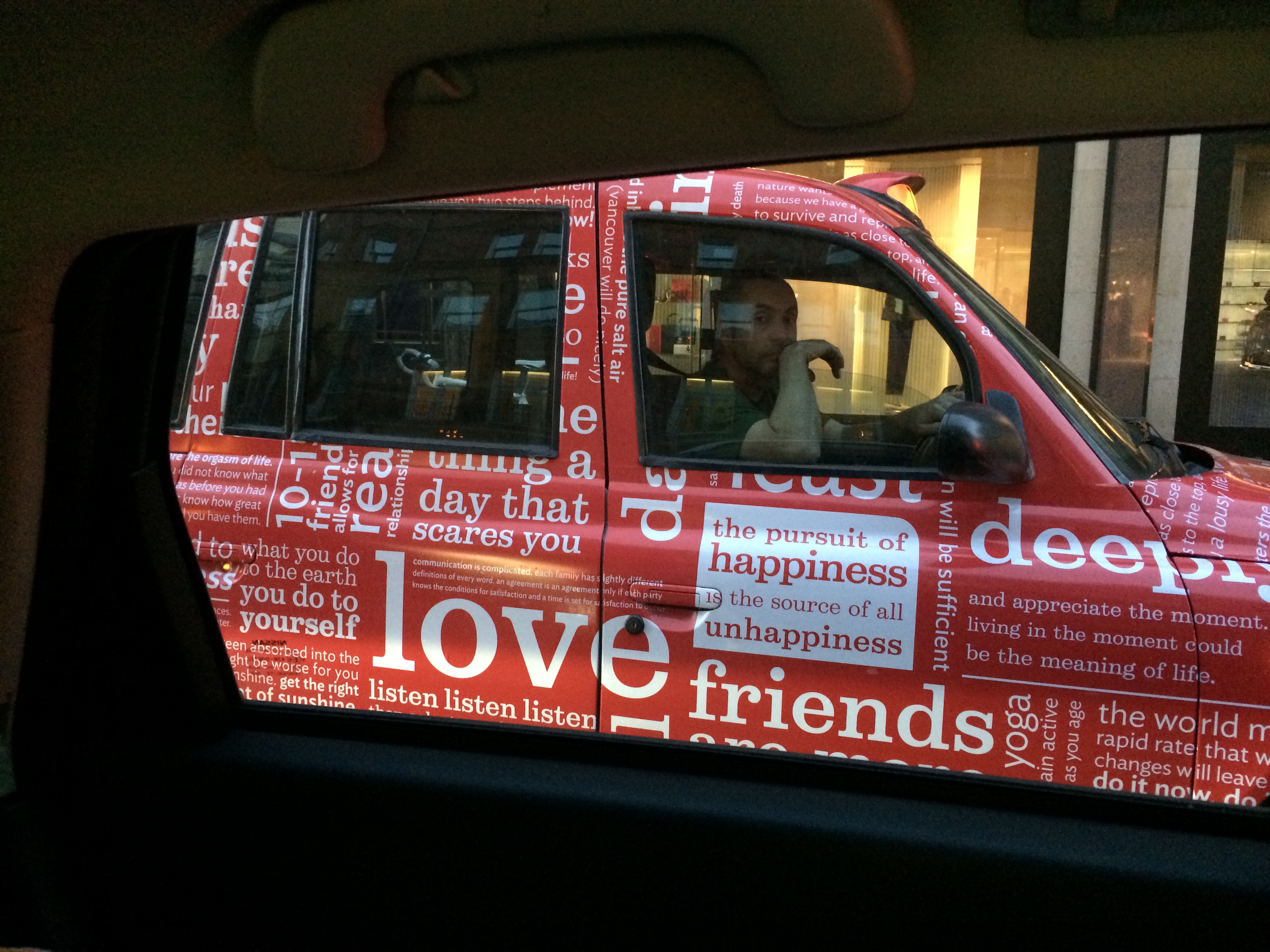
So back to London! Here were some really out of the box ads that creative directors had to put their thinking caps on for. How do you use all that space, or not a whole lot of space, to get your message across? And is it memorable enough to stick out?
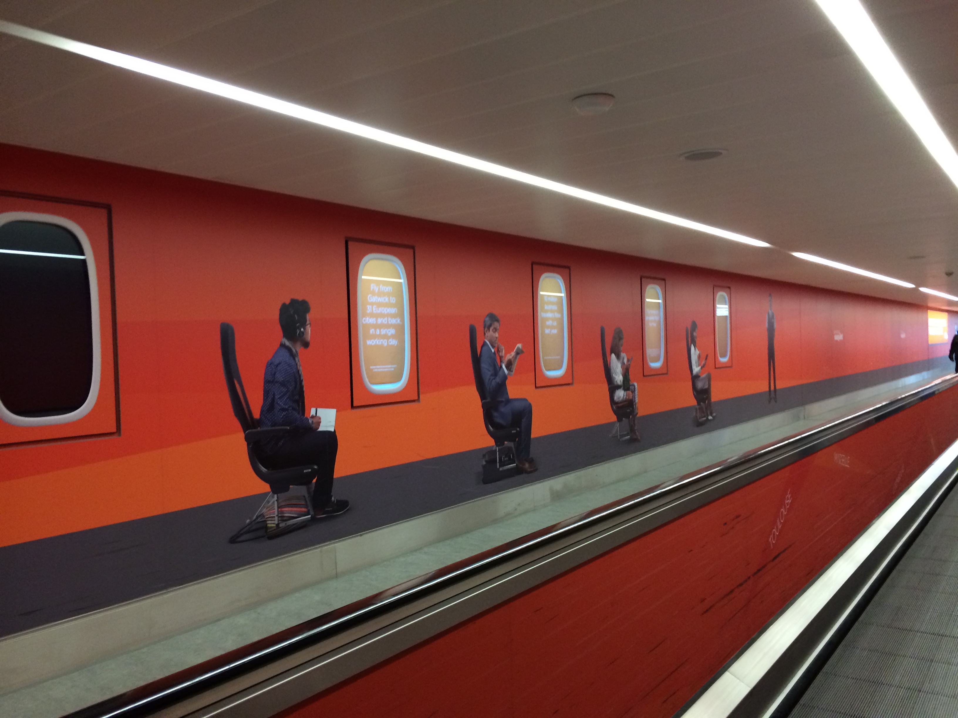
How do you get your message to weary travelers who may just be staring bleakly ahead on the people mover? Make your wall messages move. The windows would go up and down causing movement to catch the eye with different messages that would be pop up each time the window rose.
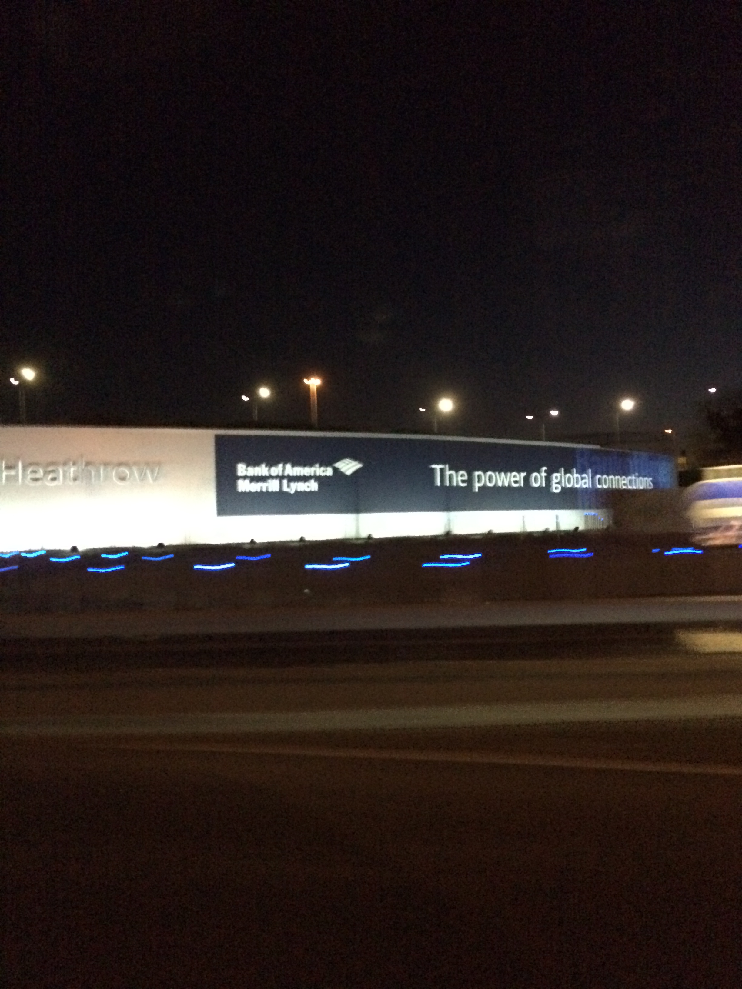
Nice copy point when your wall wrap is literally on the Heathrow Airport sign.
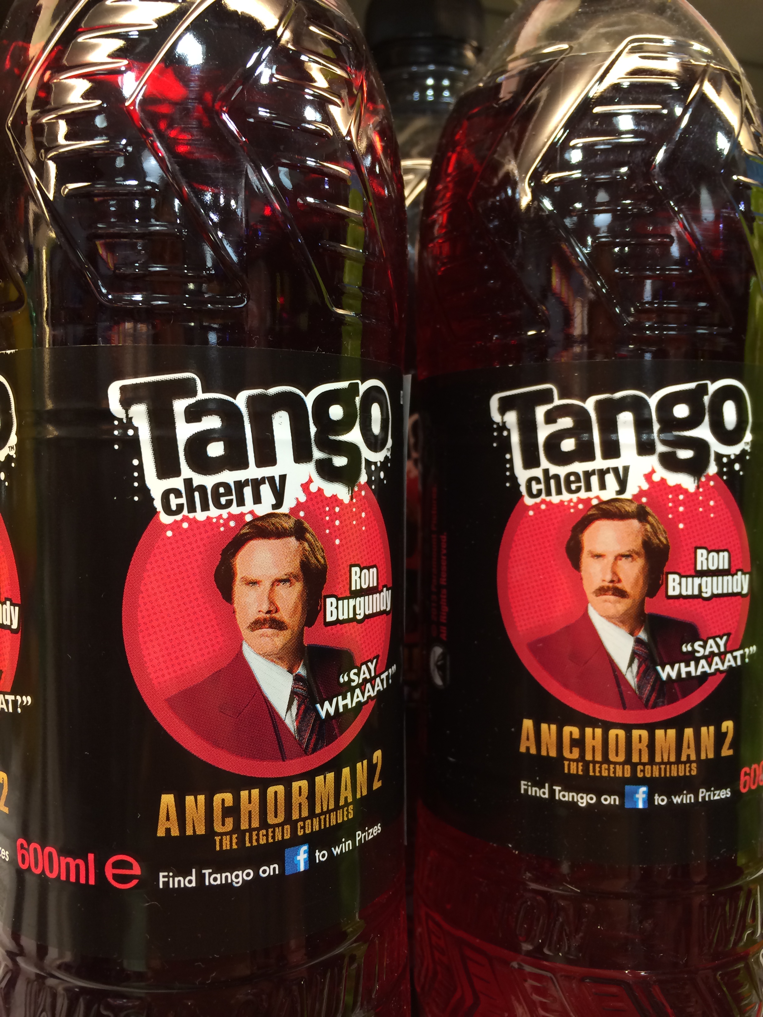
Sooo funny to find him in the cold beverage section of the convenience store.
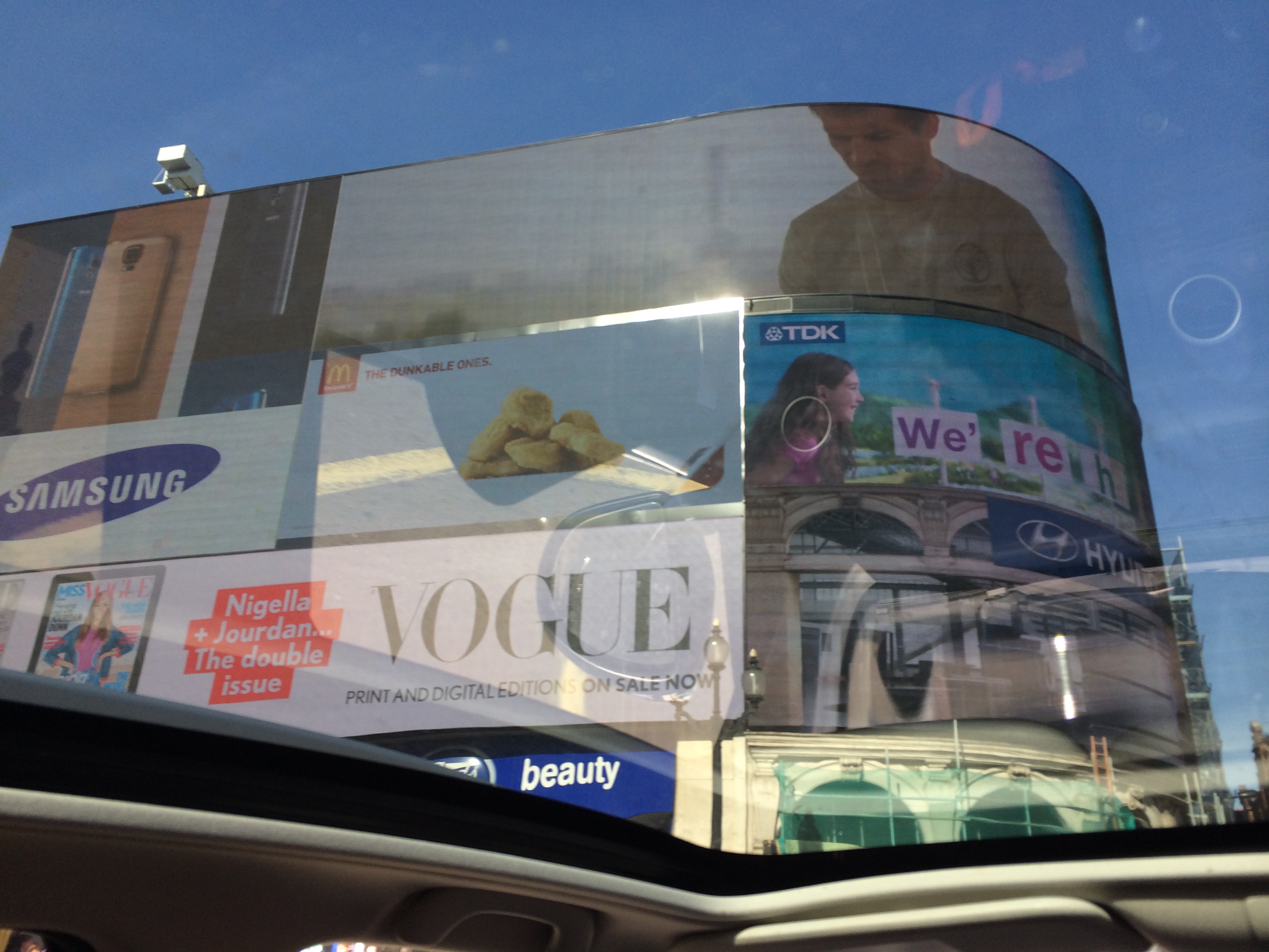
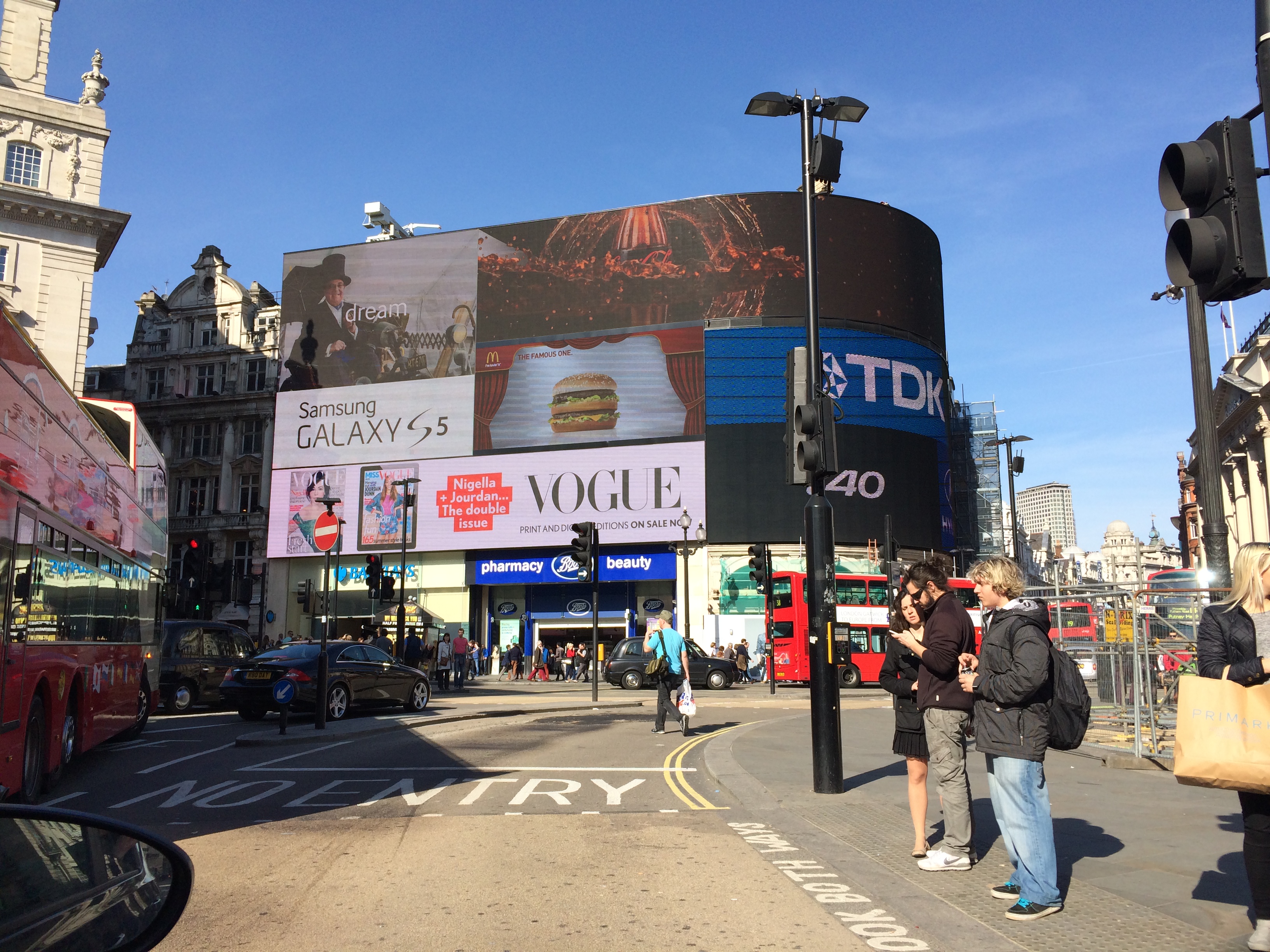
London’s Time Square! Great images that were all unconventional sizes. That’s an ad director’s worst nightmare.
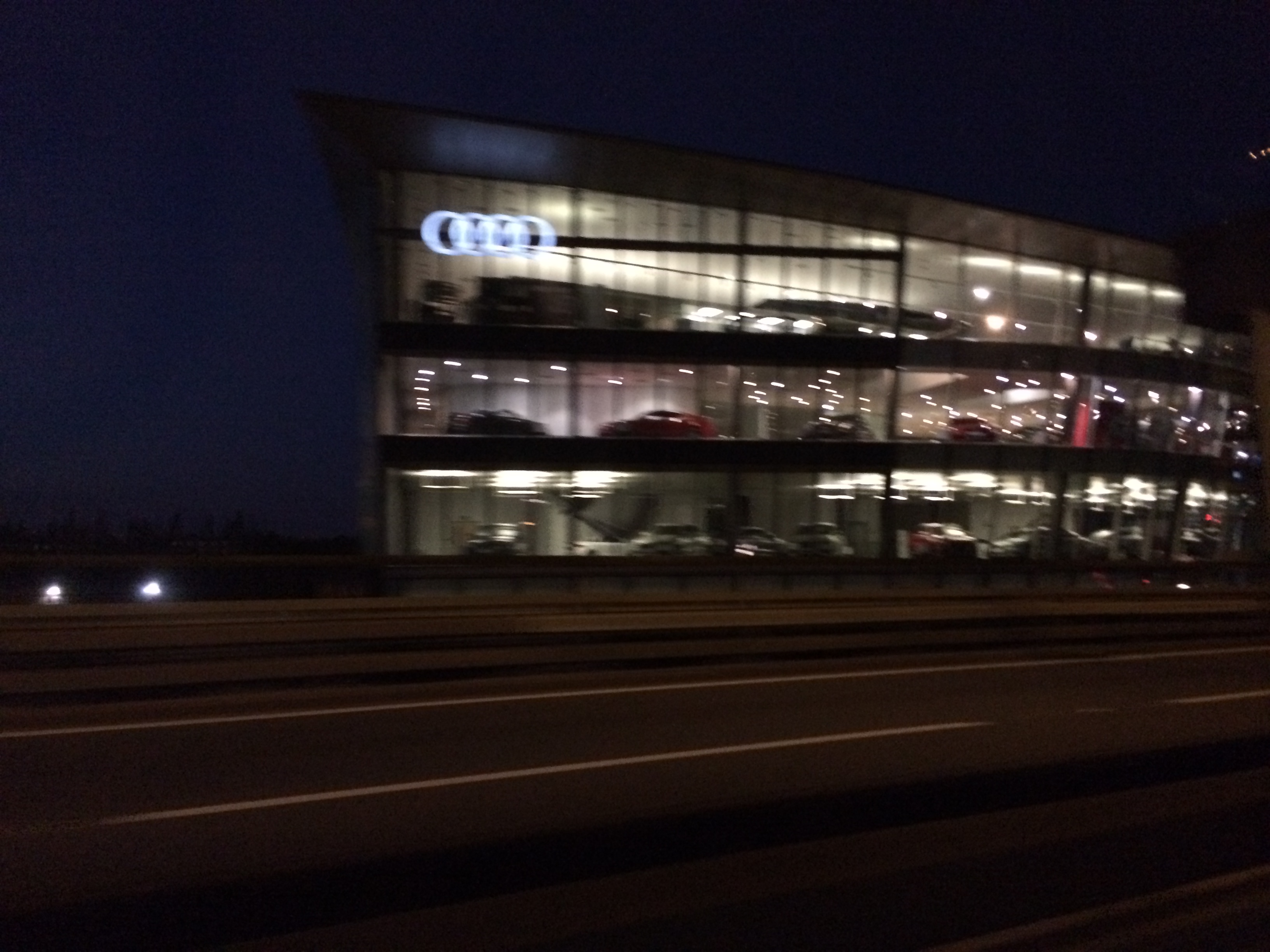
Audi uses their showroom as one giant wallscape. When space is limited and you can only go up, make your walls windows so the highway drivers can peak in and become envious.
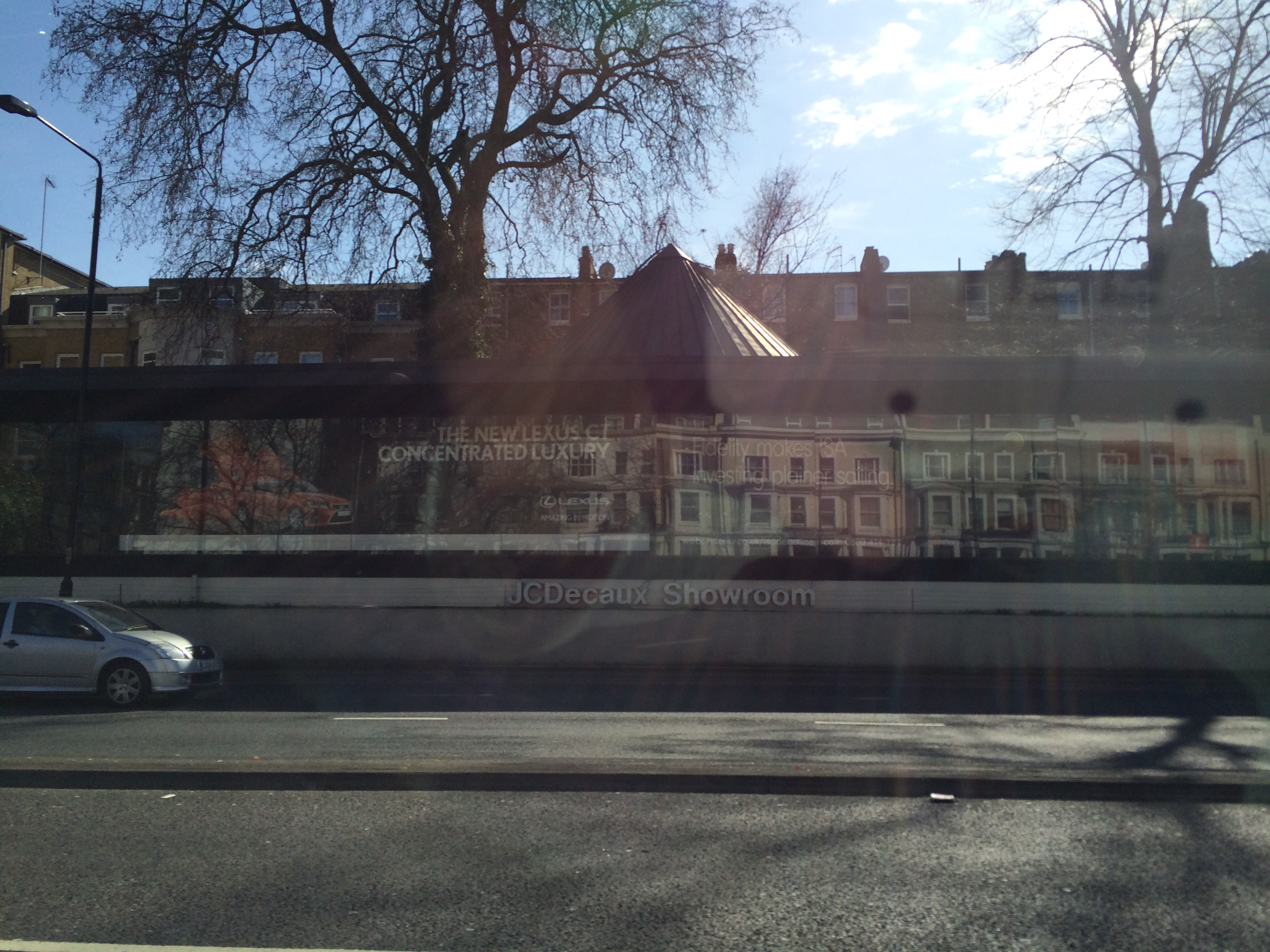
JC Decaux also showcased cars using a giant windowed “showroom.” It looks like a shadowbox. Most interesting concept for ad space that I saw.
You gotta buy there to know the brand. This is how LuLu Lemon decorates the bags they use for people’s purchased merchandise. I couldn’t even see Lulu’s logo anywhere.
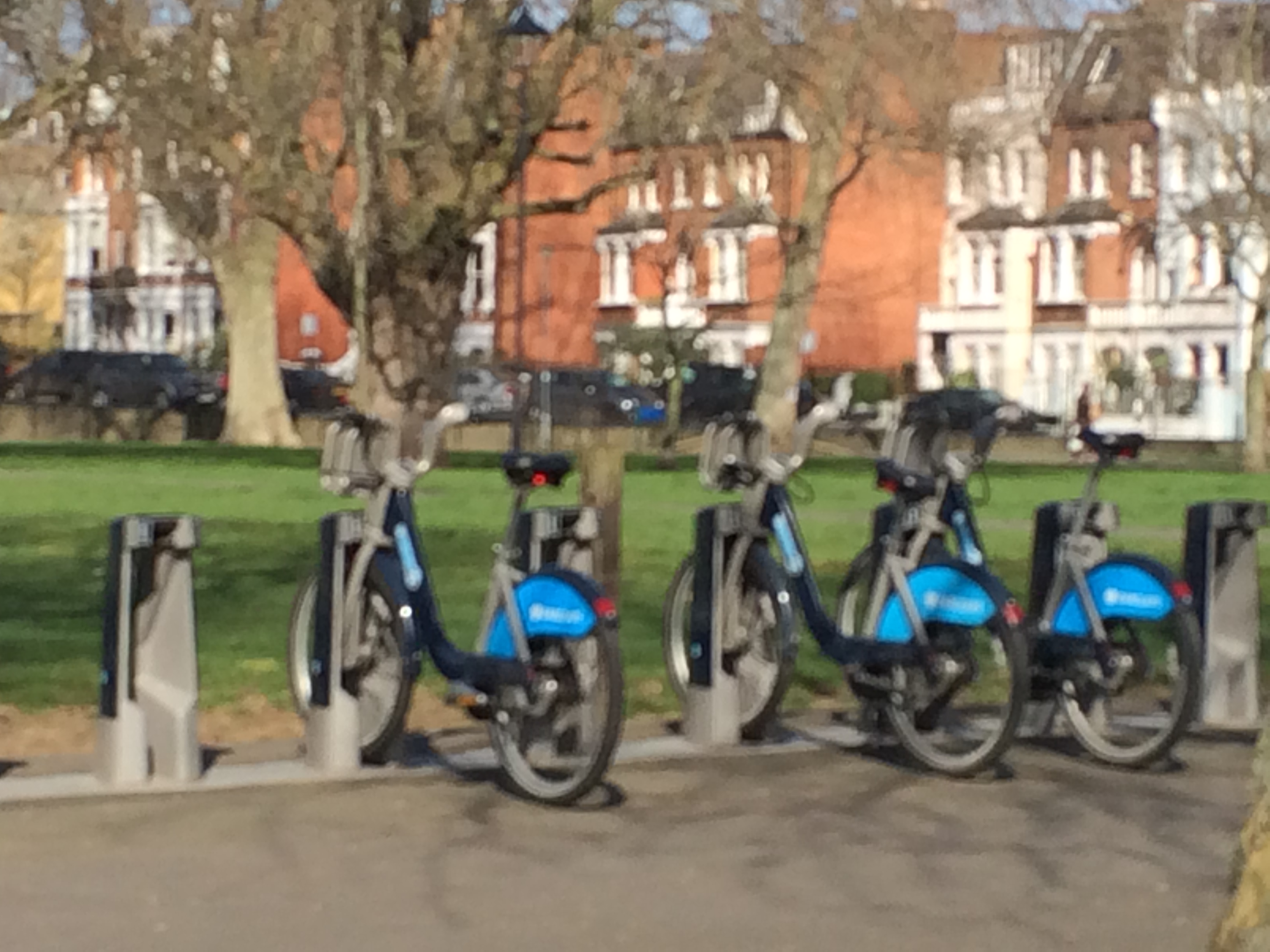
These are supposed to be called Barclay’s Bikes, but our guide told us that everyone calls them Boris Bikes, named after the mayor who brought them to town. Needless to say, Barclays is rumored to not be renewing their contract.
How do you get people to talk about your really really really old tower? Inspire them to post on social media.
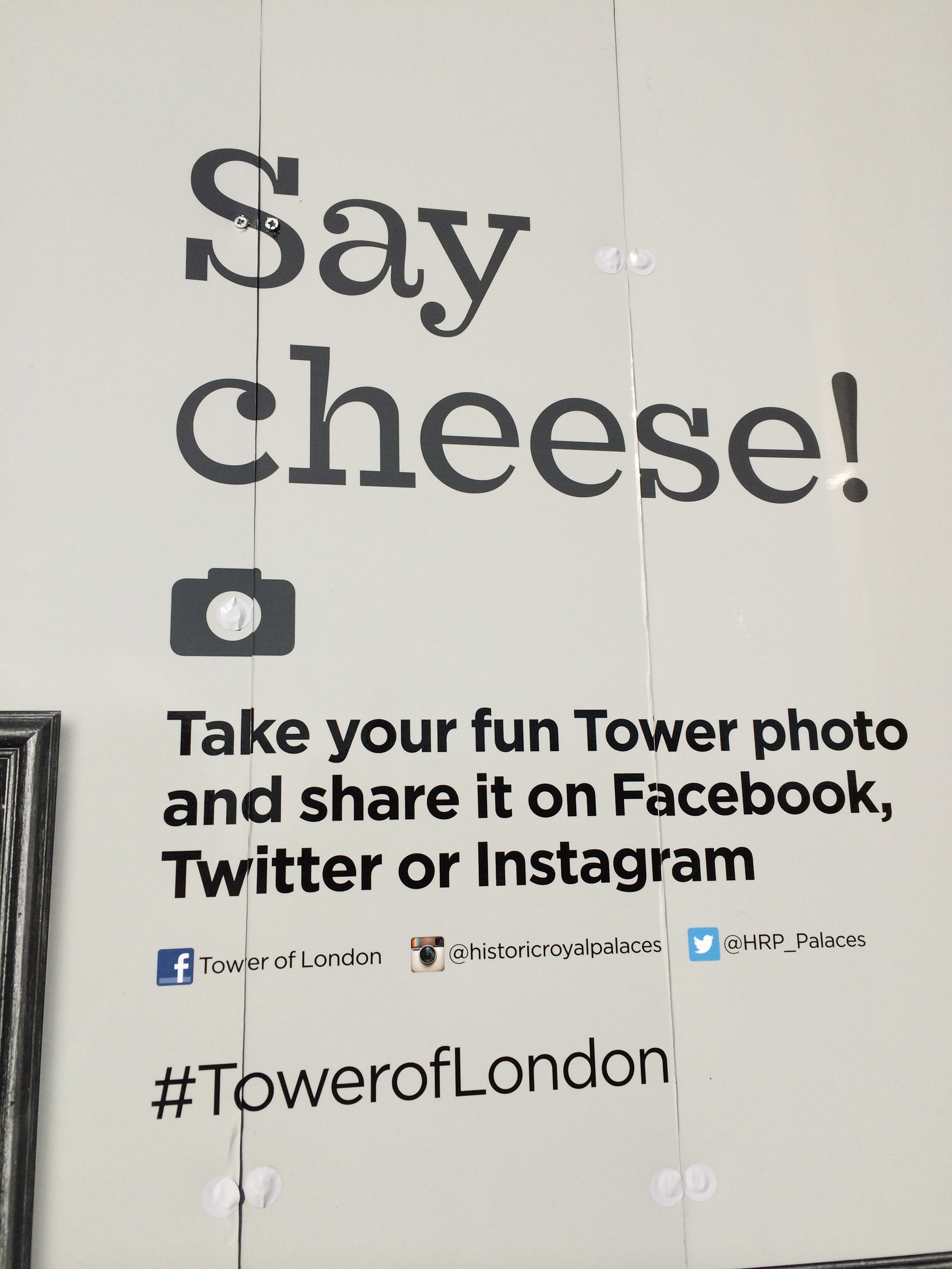
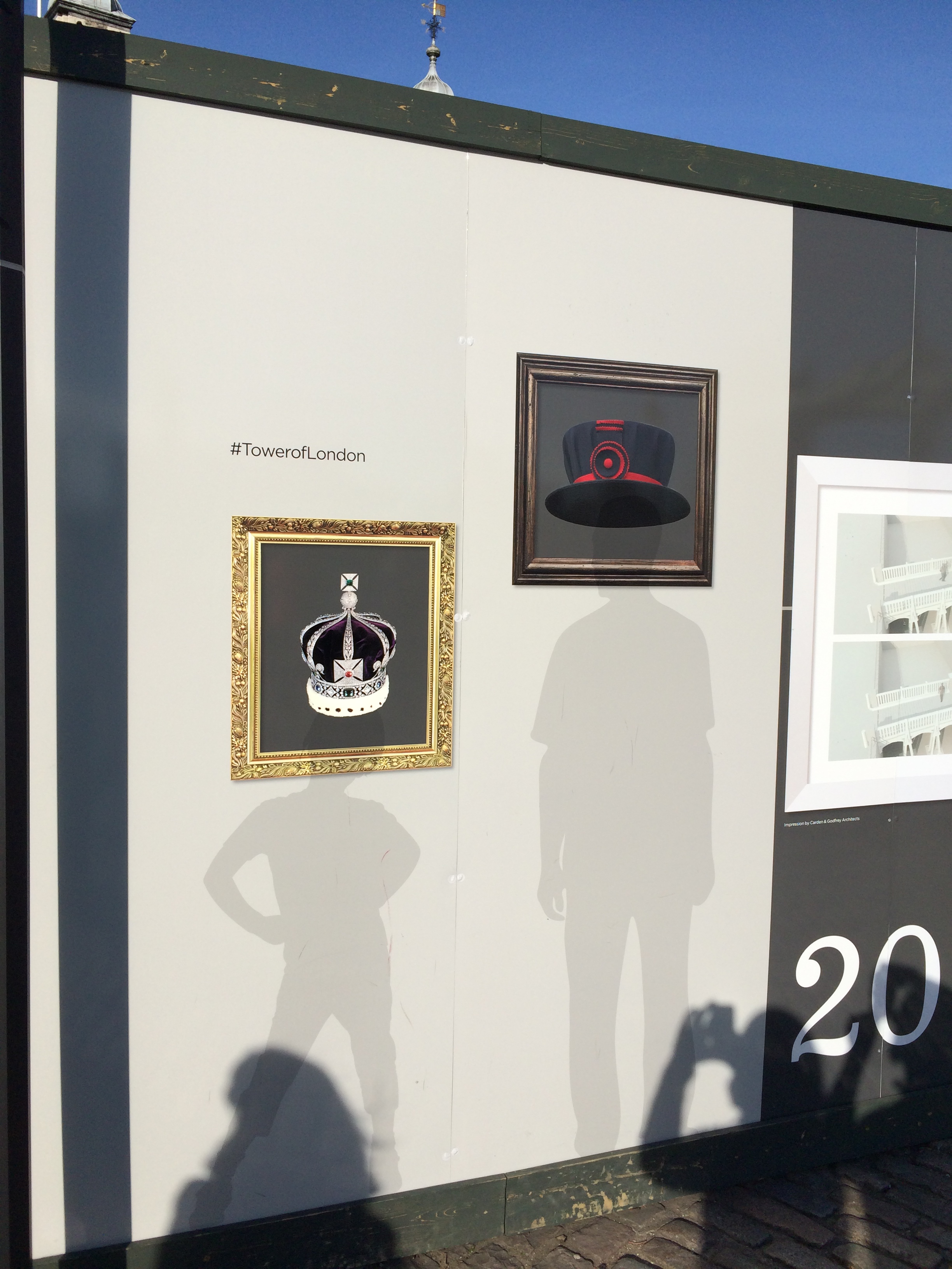
Speaking of the Tower of London,